Touch Color Kit
A tactile coloring kit designed for visually impaired users that enables independent and accurate coloring through a system of raised grids, coded crayons, and touch-based guidance.
Year:
2025
Category:
Product Design
Client:
Academic Project
Coloring is usually visual — you see the boundary, you see the color, you stay inside the lines.
For visually impaired users, that entire system breaks.
This project rethinks coloring as a tactile experience instead of a visual one
PROJECT OVERVIEW
TouchColor Kit is a tactile coloring system designed to make coloring accessible for visually impaired users.
Instead of relying on sight, it uses raised surfaces, coded crayons, and structured guidance to let users identify colors and stay within boundaries through touch.
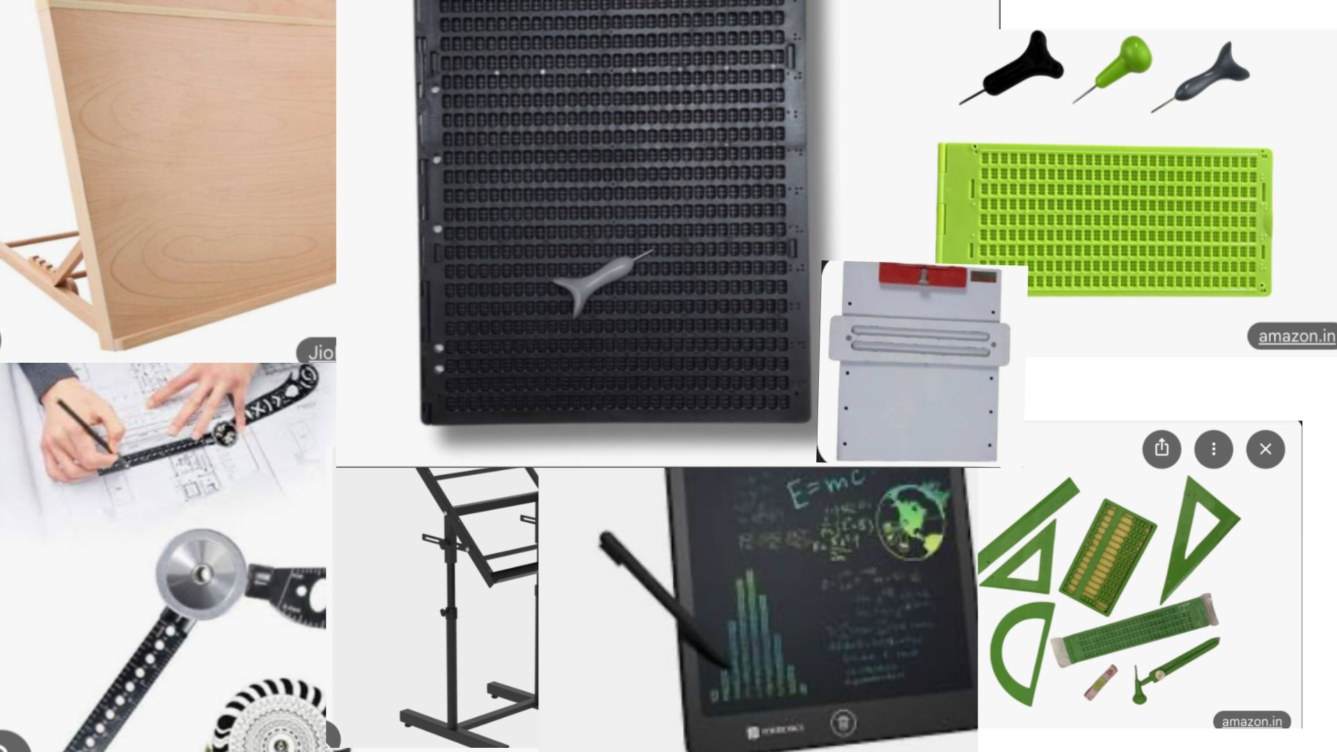
Software Used
Fusion 360, Illustrator, RD Works
APPROACH
A simple coding system links crayons to numbered sections on a raised stencil. The layered setup keeps everything stable, while physical boundaries guide the hand. The focus is on clarity, repetition, and ease of learning rather than complexity.
MARKET RESEARCH
Most existing products for visually impaired users focus on raised outlines or textured sheets. While they help in identifying shapes, they don’t solve the problem of color recognition.
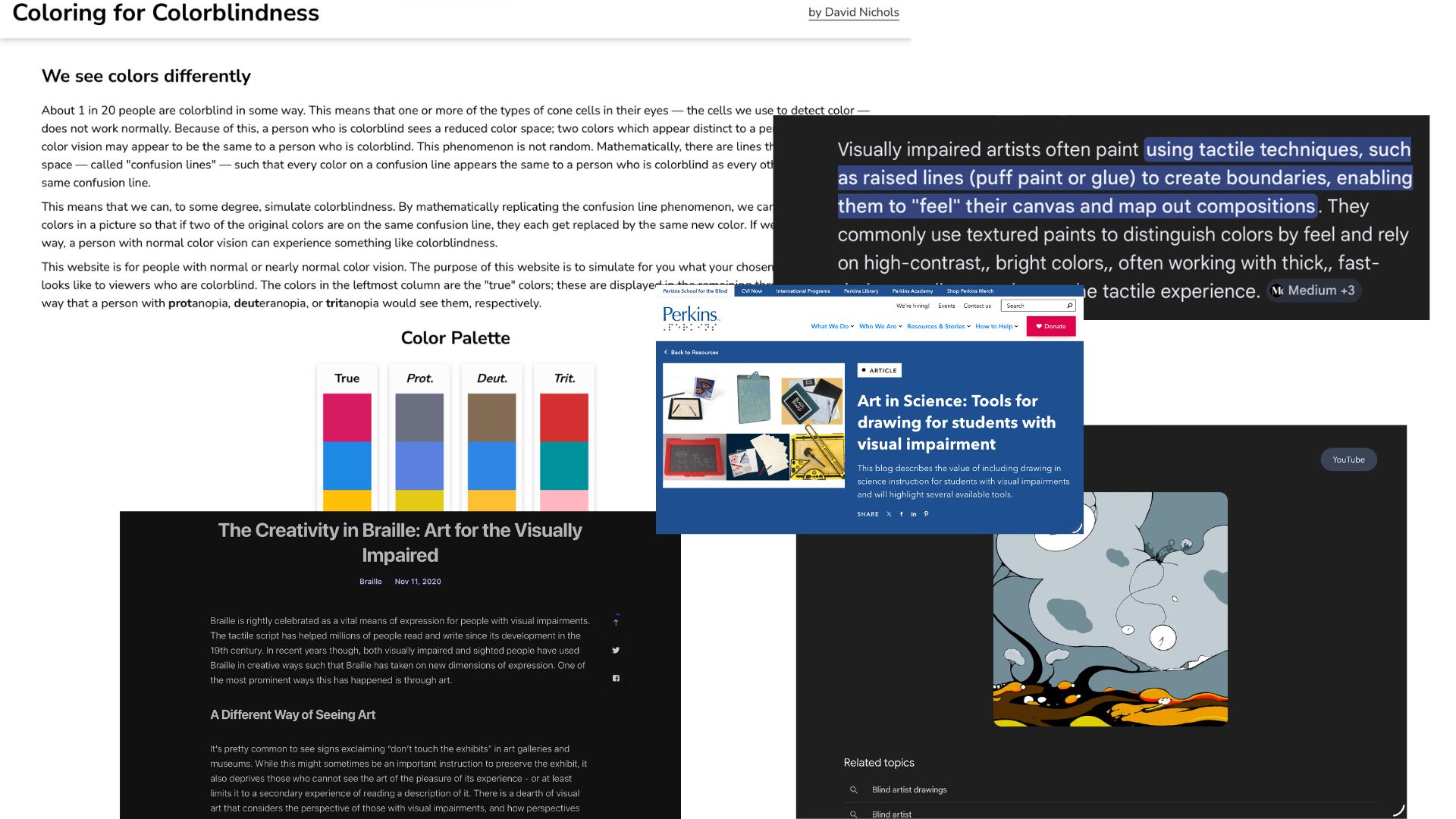
Coloring tools in the market are largely visual, and assistive products rarely integrate both color identification and boundary control in one system.
PROBLEM
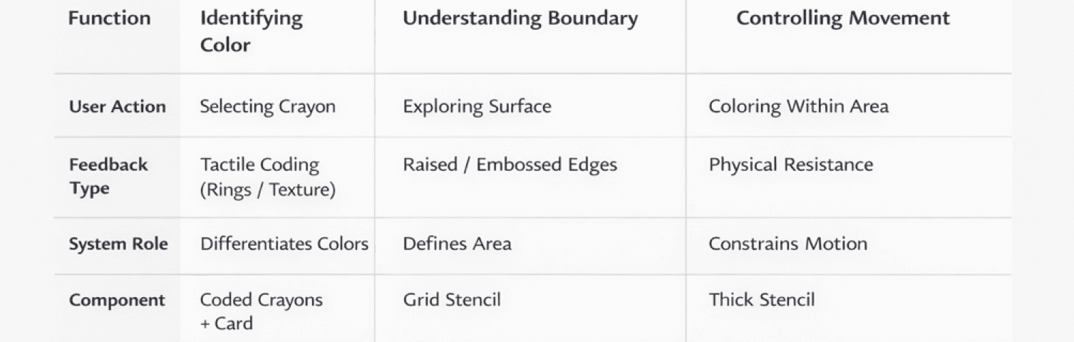
Coloring is not a single action — it is a combination of:
Recognizing a color
Locating a boundary
Controlling movement within that boundary
For visually impaired users, all three break simultaneously.
They cannot verify if they are using the correct color, cannot detect when they cross boundaries, and often cannot assess the final output. This creates a cycle of uncertainty where mistakes are invisible and correction is difficult.
TARGET AUDIENCE
Primary Users
Visually impaired and blind individuals who rely on touch to interpret and interact with information.
Secondary Users
Low-vision users
Educators and facilitators in inclusive learning environments
Caregivers supporting independent engagement
USER NEEDS
Identify colors through tactile cues
Differentiate and select accurately without visual input
Engage in creative tasks independently
Build confidence through self-guided interaction
OBJECTIVE
To design a system that reconstructs coloring into a sequence of clear, tactile decisions.
The aim is not just accessibility, but independent participation, where the user can:
Reliably identify colors without assistance
Physically navigate and respect boundaries
Complete the activity with confidence in the outcome
Engage in coloring with confidence and minimal assistance
USER INSIGHT
Interaction with the world is built through touch, memory, and repetition, not visual confirmation. impaired users rely on touch as their primary way of understanding space, objects, and actions. Instead of visual clarity, they look for physical cues — edges, textures, depth, and repetition.
Color, however, is abstract for them. It is usually communicated through assistance, memory, or association rather than direct experience.
This makes independent coloring difficult, not because of lack of interest, but because the tools are not designed for their way of perceiving.
Users feel more confident when:
Boundaries are physically defined and easy to trace
Systems are simple and repeatable (like numbers or patterns)
Feedback is immediate through touch
They tend to avoid activities where:
Outcomes are uncertain
Mistakes are hard to detect
They have to constantly depend on someone else
The key insight is that independence does not come from simplifying the activity, but from translating it into a language
DEVELOPMENT
The project began by breaking down the act of coloring into three core challenges — identifying color, locating boundaries, and controlling movement.
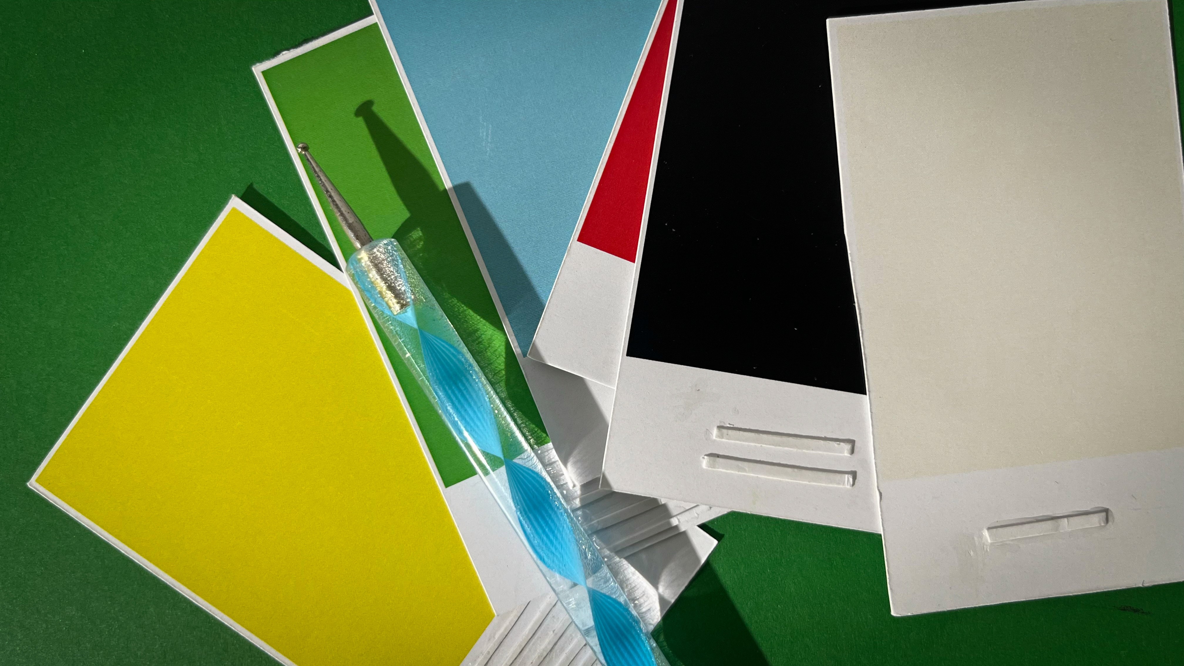
CRAYON
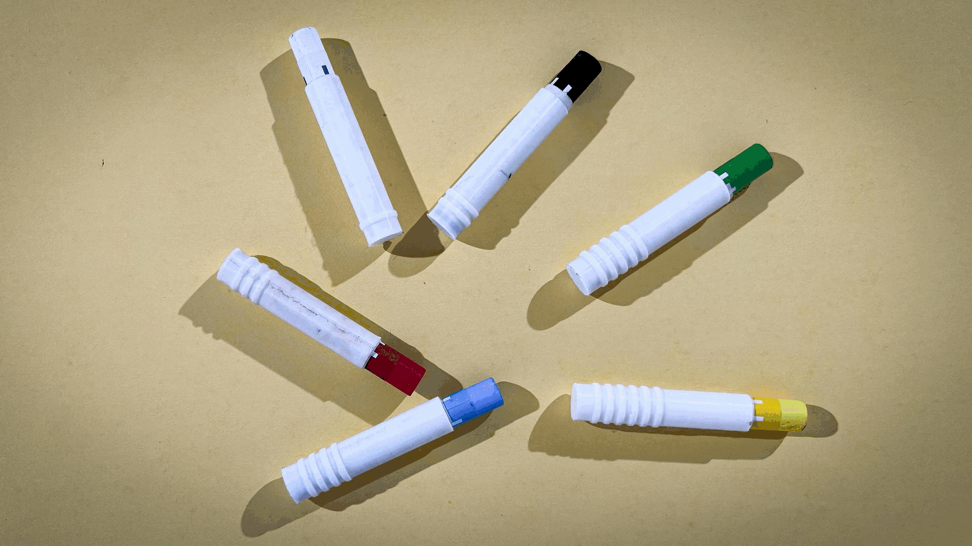
The crayon functions as the primary interface of the TouchColor Kit, translating color into a tactile language.
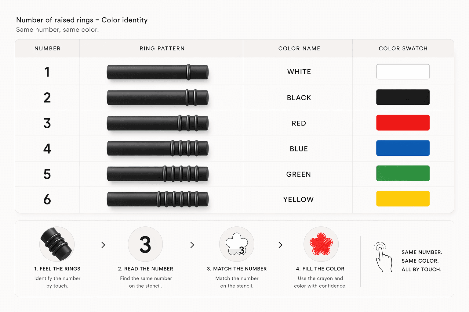
Each crayon is embedded with a distinct ring pattern, enabling users to identify colors through touch without relying on vision.
Raised rings at the base form a unique identity for every crayon.
Instead of visual labels, color is communicated through physical variation—allowing quick recognition through fingertip interaction.
Smooth upper body for uninterrupted grip
Ring zone positioned for natural thumb/finger contact
Rounded edges for safety and comfort
The design supports intuitive handling without instruction.
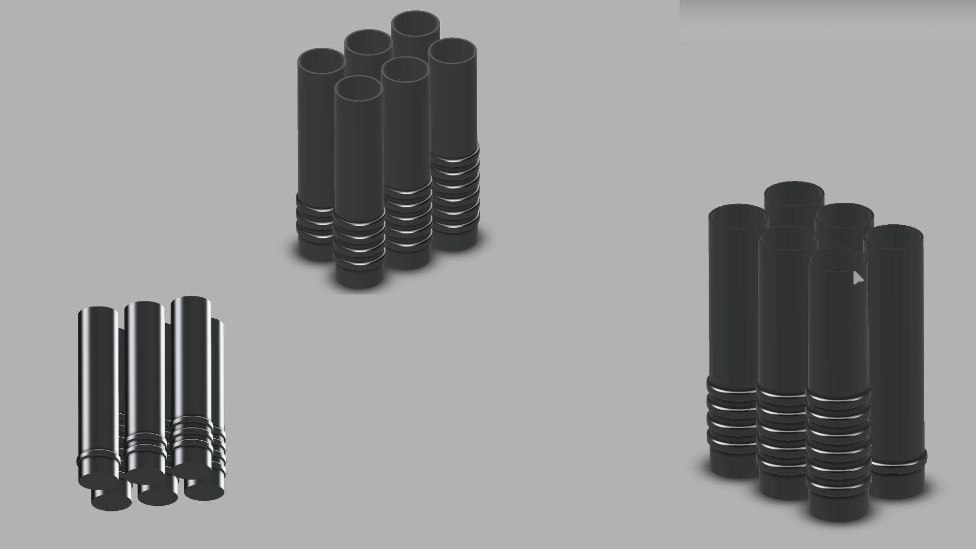
Crayon design evolved alongside this system. Initial smooth crayons were hard to differentiate, so raised rings were introduced as a direct tactile marker. The number of rings corresponds to the number , creating a clear one-to-one relationship.
STENCIL
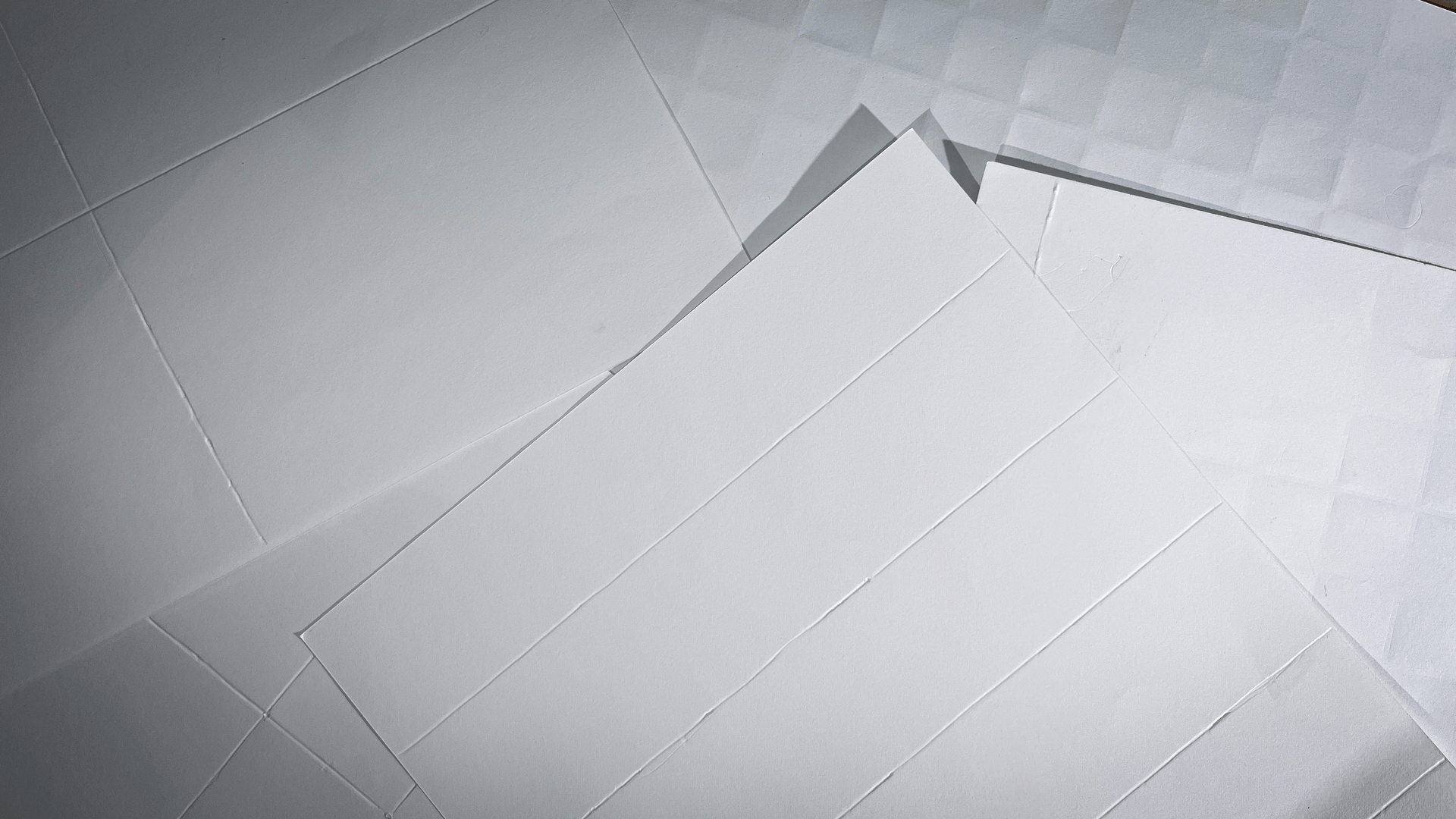
The stencil provides a structured coloring surface that translates visual boundaries into tactile guidance.
It divides the drawing into embossed sections, allowing users to feel edges and navigate spaces without visual dependency. next iteration introduced a coding system using symbols and textures. While effective, it became cognitively heavy and difficult to remember. This led to simplifying the system into numerical coding, where each color is represented by a number.
Form exploration of the drawing surface revealed that flat sheets were unstable and caused misalignment. This led to the development of the layered sandwich structure, where the stencil, paper, and base are fixed together.
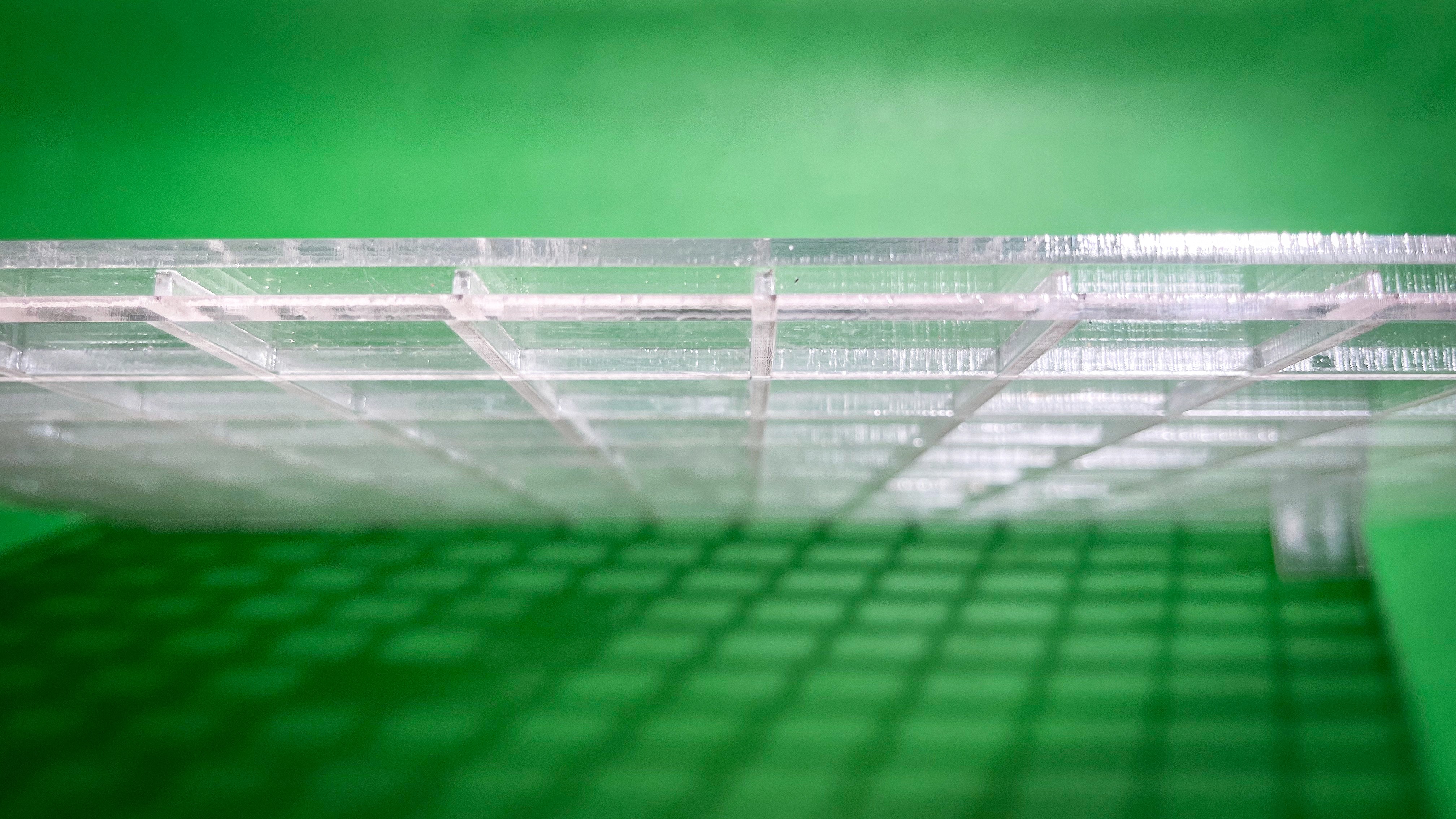
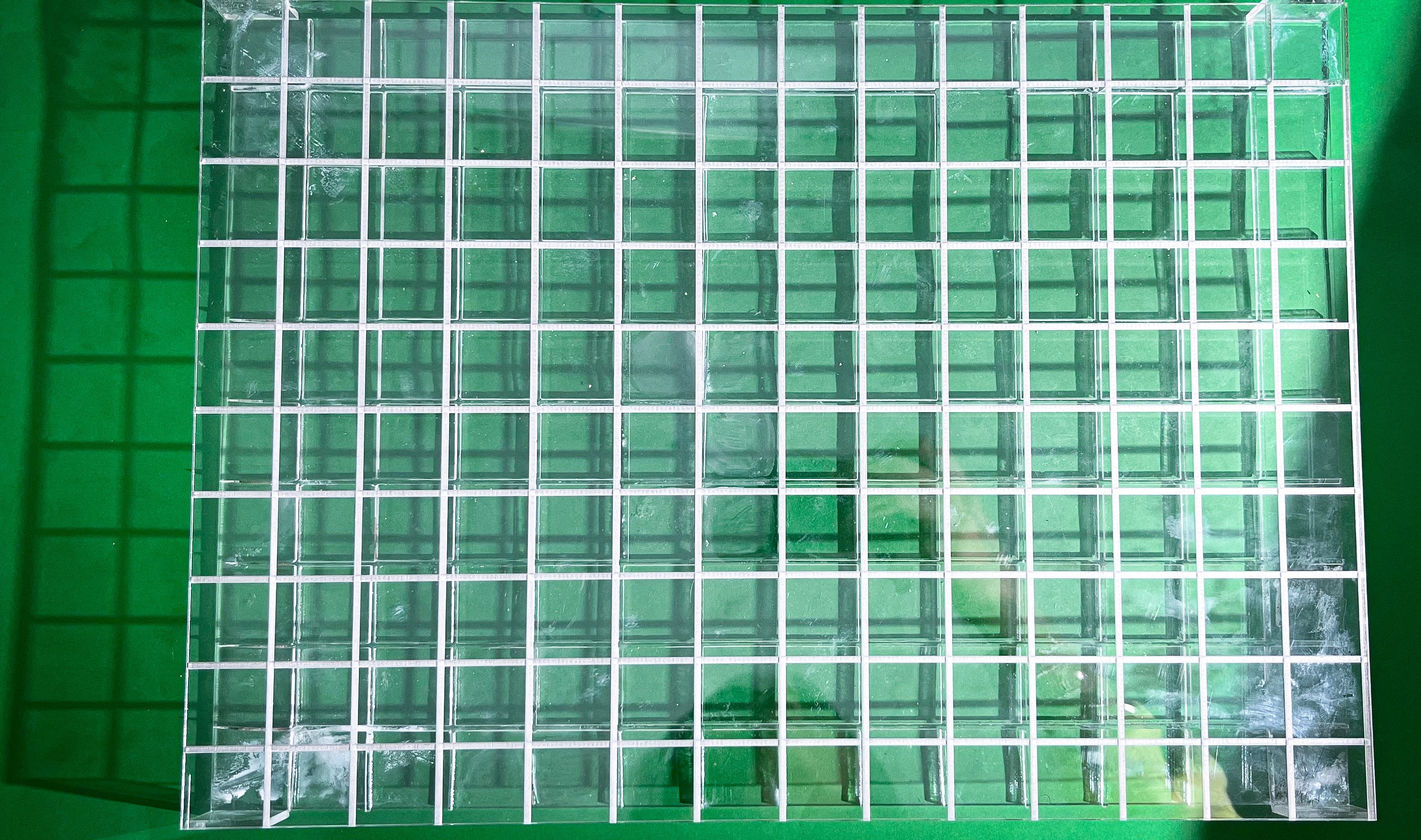
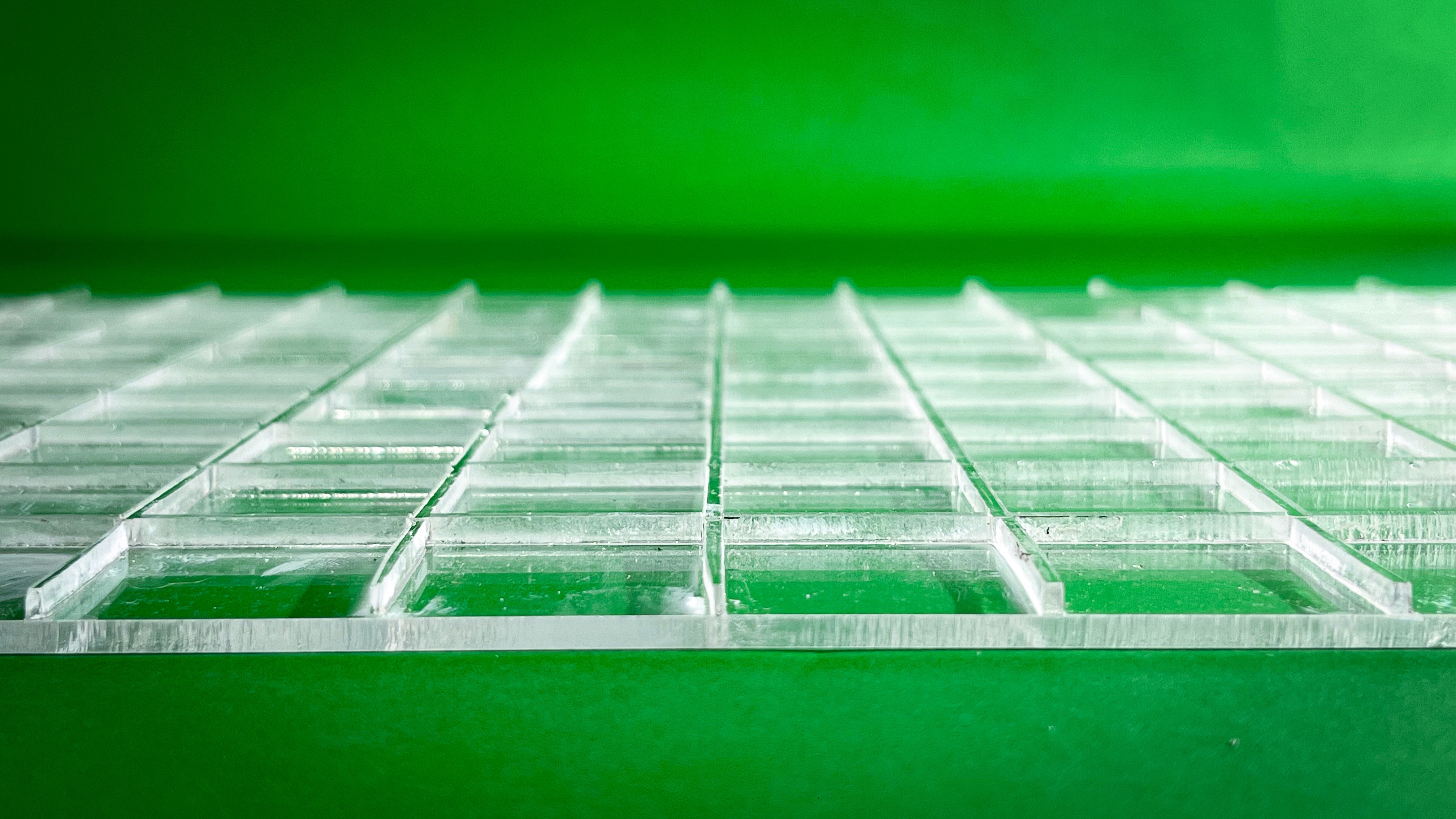
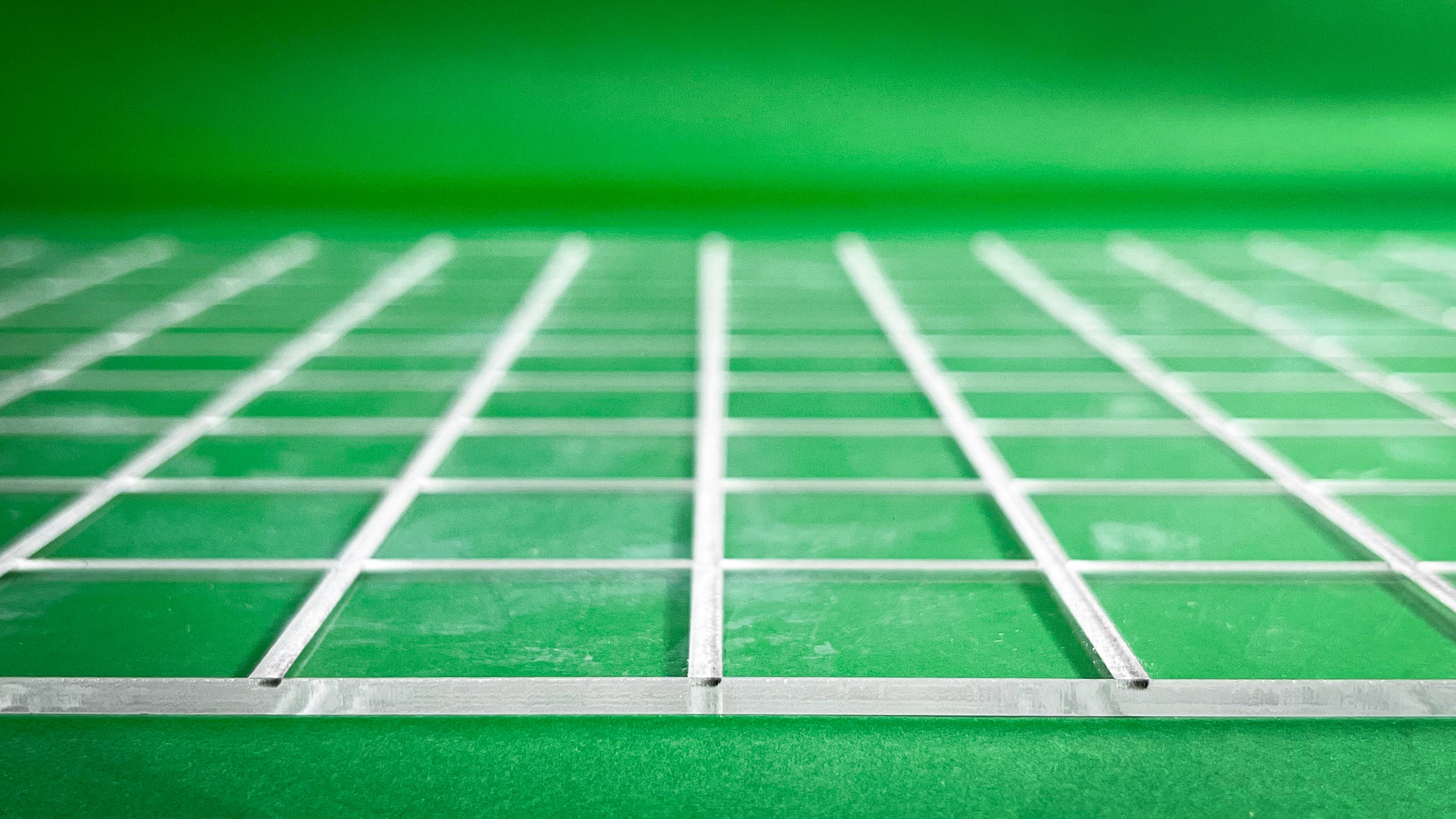
This not only improved stability but also enhanced the depth of tactile feedback.
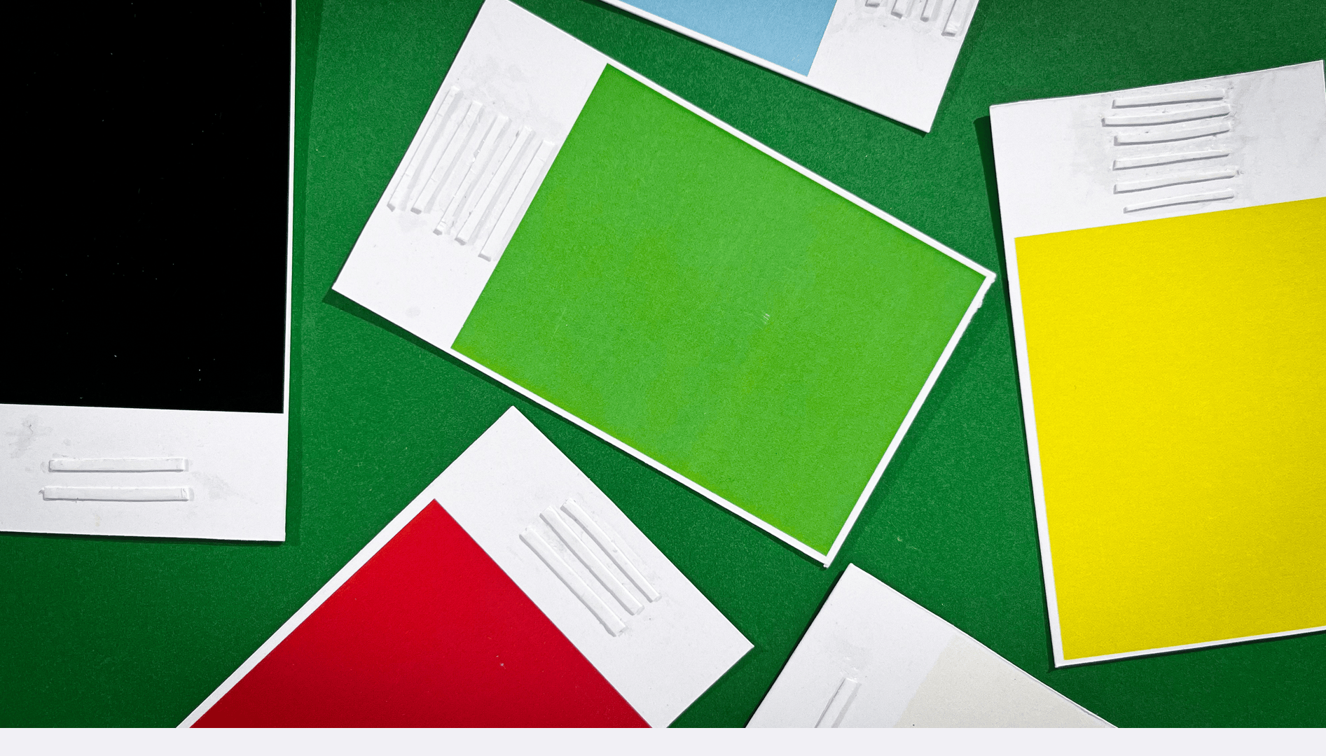
SWATCH CARD — COLOR MAPPING SYSTEM
The swatch card acts as a reference tool that connects tactile codes to color identity.
Each color is assigned a unique number, which directly corresponds to the ring pattern on the crayon. This creates a clear relationship between what the user feels and the color they are using.
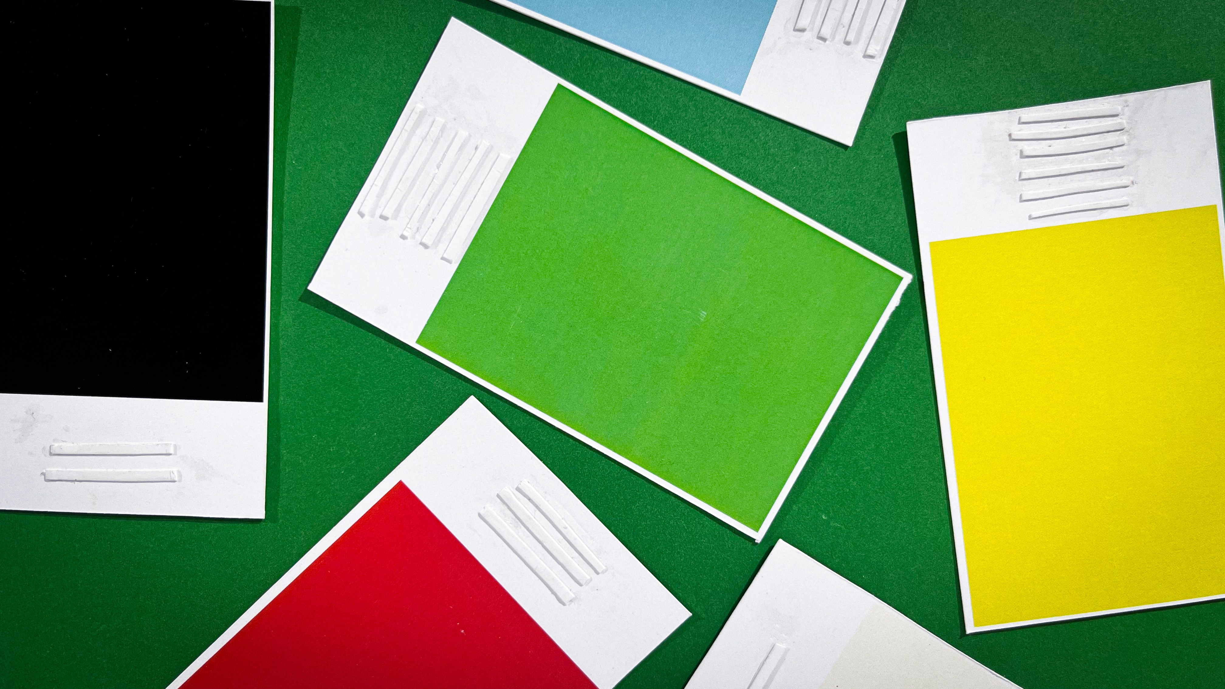
The final system balances simplicity and usability — reducing cognitive load while increasing physical clarity.
TouchColor Kit
The TouchColor Kit integrates identification, guidance, and control into a unified tactile coloring system.
Crayons serve as the primary interface. Each crayon is embedded with a unique number of raised rings, translating color into a physical code that can be through touch.
The stencil introduces structured guidance. The drawing surface is divided into embossed sections, each marked with a number that directly corresponds to a specific crayon. This eliminates guesswork and enables intuitive color selection.
A layered board system stabilizes the interaction. By securing both stencil and paper, it prevents misalignment and enhances tactile depth, making boundaries more distinct and easier to navigate
Projects
other

